

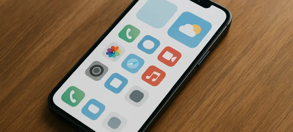
The shift in mobile user interface preferences in 2026 has led many Android enthusiasts to seek the structured elegance typically associated with competing ecosystems. Utilizing a launcher that supports cross-device licensing and smart widget integration ensures a cohesive aesthetic across multiple mobile hardware platforms. While Android provides a high level of openness, the visual consistency and minimalist design of iOS continue to set a standard for mobile productivity and ease of use. Achieving this specific look requires a departure from stock manufacturer skins and a move toward third-party environments that prioritize clean lines and intuitive navigation. Many available options on the market unfortunately compromise the experience with heavy background processes or intrusive advertisements that detract from the overall utility of the device. Consequently, selecting a refined and lightweight launcher is the essential first step for any user who wants to enjoy the flexibility of their hardware while benefiting from world-class interface design.
1. Initial Setup: Acquiring the Software and Accessing Settings
The initial stage of this customization journey involves acquiring a robust software foundation that can handle complex layout changes without sacrificing system stability. Smart Launcher 6 is currently recognized as a leading solution for this task, offering a balance between the grid-based logic of Apple’s software and the functional depth of the Android kernel. Users should begin by downloading the application from the Google Play Store, where it serves as a gateway to a more refined mobile experience. While the standard version is functional, upgrading to the Pro tier is often the preferred route for power users, as it removes advertisements and unlocks premium visual assets like the Frosted Glass theme. This theme is particularly effective at mimicking the translucent, high-end feel of modern smartphones, creating a more professional atmosphere. Furthermore, the Pro version includes smart widget capabilities that allow for dynamic content updates throughout the day, ensuring beauty and high utility.
After the software is installed and designated as the primary interface, the next objective is to enter the backend of the environment to begin structural adjustments. Accessing the configuration menu is a straightforward process that bypasses the need for navigating through the standard system settings of the phone. By performing a deliberate long-press on any unoccupied region of the home screen, the user triggers the configuration overlay, which provides a comprehensive suite of tools for visual modification. This menu is the nerve center of the transformation, where fundamental changes to icon scaling and color palettes are implemented to align the device with a more polished aesthetic. It is here that the transition from a traditional app drawer to a more organized system begins, laying the groundwork for a streamlined user experience. This preparation is vital, as it ensures that all subsequent functional additions are integrated into a stable and visually harmonious mobile environment for the long term.
2. Interface Refinement: Implementing the Dock and Navigation
Once the core settings are established, the focus shifts to one of the most recognizable components of the iOS interface: the application shelf or dock. Activating this feature within the launcher’s settings provides a persistent area at the base of the screen where the most essential communication and productivity tools are housed. This addition is not merely cosmetic; it significantly enhances the ergonomics of the device by placing high-priority shortcuts within the natural reach of the user’s thumb. In this specific configuration, the dock can be adjusted to feature various levels of transparency, allowing it to blend seamlessly with the chosen wallpaper while maintaining its distinct functional identity. This approach brings a sense of order to the mobile desktop, preventing the scattered appearance that often plagues standard Android home screens. By carefully selecting a small number of critical applications to reside in this space, the user creates a reliable navigation anchor that facilitates faster switching.
Establishing a fluid interaction model is the next priority for those seeking to emulate the sophisticated feel of a high-end mobile operating system. This is achieved by entering the “Gestures and Hot Keys” section of the settings, where the user can redefine how the software responds to physical inputs. In the current 2026 technological landscape, these shortcuts are the primary method for maintaining a clean, button-free display that prioritizes content over navigation bars. Assigning specific commands to these gestures allows for a level of hidden functionality that makes the device feel more intelligent and responsive. For instance, the system can be configured to recognize a variety of multi-finger swipes or taps, mirroring the gesture-heavy navigation that has become a hallmark of modern mobile design. This phase of the setup process ensures that the phone is not just a visual replica of another system but actually functions with the same level of grace and efficiency during daily usage.
3. Aesthetic Polish: Visibility Controls and Visual Tools
To further enhance the minimalist appeal of the new interface, the user should assign a specific command to the double-tap gesture on the home screen. By selecting the “Double Tap” option from the list of available shortcuts, the user can link this action to the visibility of the newly created application dock. Choosing the “Show or Hide Dock” command creates a dynamic element that allows the interface to adapt to the user’s immediate needs with a simple physical interaction. When the dock is hidden, the screen provides an unoccupied view of the background imagery and widgets, achieving a level of visual purity that is highly valued in modern design. When access to the primary toolset is required, a quick double-tap brings the icons back into view instantly. This toggle functionality represents a significant improvement over static layouts, offering a way to keep the most-used apps accessible without permanently occupying valuable screen real estate in a cluttered manner.
The final touch in creating an authentic iOS-like experience involves the strategic placement of informational tools and the curation of visual feeds. By swiping to the left of the main screen, users can set up a dedicated widget page where various utilities are consolidated into a clean, uniform layout. It is important to select widgets that follow the design principles of the launcher to ensure every element, from the weather forecast to activity tracking, feels like a cohesive part of the overall system. Additionally, swiping to the right provides access to a customized news feed that keeps the user informed without requiring the opening of separate applications. This informational ecosystem is designed to mirror the “Today View” found on competing platforms, utilizing cards and rounded corners to maintain the established aesthetic. By fine-tuning these feeds, the Android device completes its transformation into a highly polished, elegant, and efficient digital workspace that offers a truly unique and professional user experience.
4. Operational Success: Evaluating the Digital Metamorphosis
The successful implementation of an iOS-inspired interface on Android proved that user experience was increasingly a matter of software selection rather than hardware loyalty. By prioritizing a launcher that offered sophisticated gesture controls and a clean experience, the user successfully bypassed the limitations of typical stock manufacturer overlays. The integration of a toggleable dock and cohesive smart widgets demonstrated that the Android platform remained the most versatile foundation for personal expression in 2026. For those who looked to maintain this refined look, the next logical steps involved exploring advanced icon masking techniques and fine-tuning the blur levels of the Frosted Glass theme to match the specific resolution of their hardware. These efforts resulted in a device that felt consistently premium and professional throughout its daily operation, proving that personalization remained the greatest strength of the modern mobile ecosystem for all dedicated power users. Ultimately, this customization project confirmed that with the right software and a methodical approach, any mobile user could enjoy a bespoke interface that combined the best design elements from across the entire technology industry. The transition was further verified by the seamless interaction between the hidden dock and the smart informational feeds, which provided a significant boost to daily efficiency by reducing visual noise and streamlining navigation through customized gestures. Moving forward, the adoption of these specialized environments suggested that the distinction between mobile operating systems was becoming less about visual style and more about the underlying capabilities of the software. Those who adopted this approach reported a higher level of satisfaction with their mobile devices, as the combination of Apple’s aesthetic and Google’s flexibility offered a perfect middle ground for both casual and professional use cases.