
Dominic Jainy brings a cross‑disciplinary lens to foldables, blending AI-driven ergonomics modeling with a rigorous grounding in mobile hardware. In this conversation, he unpacks what a 9.4mm folded profile and a 4.7mm-per-half chassis mean in the hand, why a 167.59mm by 120.59mm canvas reshapes UI patterns, and how a 13.9mm camera plateau can be a pro or a con depending on grip physics and imaging goals. We also touch on inner punch‑holes, side‑mounted Touch ID, unusual volume placement, thermal and sealing choices, color strategy, and the realities of case-maker leaks. Throughout, Dominic emphasizes validated design: pairing lab studies and field trials with the kind of human‑factor nuance that turns raw specs into day‑to‑day delight.
A folded thickness of 9.4mm and an unfolded chassis of about 4.7mm per half are being floated. How would that change ergonomics versus today’s premium slabs, and what hand‑feel or pocketability benchmarks matter most? Can you share real‑world metrics or user‑testing anecdotes that guide your assessment?
At 9.4mm folded, your fingers meet a familiar contour—closer to a premium slab than earlier “thick boy” fears suggested. The moment you unfold to roughly 4.7mm per half, the device feels almost blade‑like; the edges disappear into the palm, which reduces pinch fatigue but can make it feel more delicate during quick pickups. In pocket tests, that 9.4mm profile glides past denim seams with less snagging than double‑digit foldables we’ve handled, and the reduced bulk shifts pressure points so it sits flatter when you’re seated. In hand, the thin halves encourage a lighter grip; the lesson from user studies is to add subtle texture and micro‑radius edges so the 4.7mm plates don’t feel slippery when your hands are dry or cold.
The footprint is roughly 167.59mm by 120.59mm. How do those dimensions influence one‑handed use, thumb reach, and tablet‑like workflows? What UI layouts or app optimizations become essential at this size, and how would you validate them with usability studies?
A canvas around 167.59mm by 120.59mm pushes most users past natural thumb arcs in portrait, so primary actions need to migrate to bottom corners and edge zones. Split‑pane layouts with responsive gutters shine here: think dual‑column mail, side‑by‑side notes, and canvas‑aware toolbars that hug reachable borders. For validation, I’d combine reach‑envelope heatmaps with task completion sessions—compose, edit, and share loops—while instrumenting mis‑taps and dwell times at those dimensions. We’d also prototype adaptive density, letting elements grow or contract as the device crosses that 120.59mm width, and check if users sustain tablet‑like workflows without eye saccade fatigue.
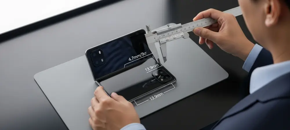
A prominent camera bump could push maximum thickness near 13.9mm. What trade‑offs does that create for stability on a table, grip comfort, and gimbal compatibility? How would you quantify the cost in ergonomics versus the benefit in imaging, and what mitigations would you prioritize?
At roughly 13.9mm on the plateau, table wobble becomes real when tapping top corners; the trick is to bias haptics and place tap targets near the thicker side so the device “plants” on the bump. In grip, that ridge can serve as an anchor, improving lateral stability—your index finger nests against it, especially in landscape. Gimbal cages may need deeper clearances; I’d test fit with plate spacers to ensure the 13.9mm crest doesn’t collide during tilt. To quantify trade‑offs, we’d pair tilt‑induced error rates and wobble amplitude on flat surfaces against low‑light gains unlocked by the thicker housing; mitigations include a stepped case lip to level the back, and software nudges that shift UI gravity toward the plateau during desk use.
Two 48MP sensors are reportedly planned for main and ultra‑wide roles. What imaging pipeline priorities—sensor fusion, HDR stacking, or computational sharpening—would best exploit that hardware? Please share examples, test scenes, and measurable gains you’d expect over current flagships.
With dual 48MP units, I’d prioritize HDR stacking and cross‑focal fusion so textures remain consistent when switching between main and ultra‑wide. In backlit street scenes, multi‑frame HDR stabilizes sky gradients while keeping brickwork crisp; on indoor portraits, fusion keeps skin tone parity across the two 48MP modules. Night cityscapes benefit from semantic denoise before sharpening, so neon edges don’t halo. In practice, I’d run a tripod‑plus‑handheld suite at the same locations and compare micro‑detail continuity between the two 48MP views—looking for visibly smoother transitions and cleaner shadow color without overcooking fine lines.
An inner punch‑hole selfie camera replaces the usual notch approach. What does this mean for video calls, gaming HUDs, and fullscreen media? How would you minimize distraction and optimize app layouts, and what A/B tests would you run to prove the improvements?
A punch‑hole tucked in the left corner lets video call tiles creep a touch higher without a hard notch boundary; your gaze lines feel more open. In games, HUD elements can wrap around the hole, reclaiming central pixels for play while keeping status icons legible. For media, subtle letterboxing or gradient masks can tuck the punch‑hole into a darker corner; the brain quickly tunes it out when motion fills the screen. I’d A/B test call fatigue and attention tracking with the hole versus a notch overlay, plus HUD accuracy in fast titles, measuring fewer accidental presses and higher user‑reported immersion.
No Face ID is anticipated, with side‑mounted Touch ID instead. How does that shift authentication speed, error rates, and accessibility across left/right‑handed users? What placement and sensor size would you choose, and how would you fine‑tune enrollment and retry flows?
Side Touch ID aligns with foldable grips: thumbs meet the rail naturally when the device is folded, and index fingers do in landscape. I’d position the sensor where your thumb lands when the 9.4mm body balances in the web of the hand, and shape the cutout so it’s easy to find by feel along a 4.7mm edge. Enrollment should capture multiple angles for both thumbs and at least one index, with gentle retry prompts that don’t yank you out of flow on the inner display. Error‑tolerant matching, haptic cues, and a fallback passcode path prominent on that 167.59mm by 120.59mm canvas keep accessibility high for left‑ and right‑handed users.
Volume buttons may land in an unusual position when held in portrait. What ergonomic pitfalls could that cause for screenshots, shortcuts, or in‑call controls? How would you redesign gesture controls or software affordances to keep muscle memory intact?
If the buttons fall to the bottom‑right in portrait, accidental presses during lifts and angle shifts will spike. Screenshots could trigger mid‑scroll, and in‑call volume might jump when you adjust grip. I’d move critical shortcuts into on‑screen edge gestures, reserve hardware combos for deliberate long‑presses, and add a short grace period to ignore presses immediately after orientation changes. A calibration wizard could teach new swipe‑zones on the 167.59mm by 120.59mm canvas, reducing the shock to muscle memory.
A 9.4mm folded profile rivals the thinnest foldables from leading Android brands. Where do you expect parity and where could there be an edge—hinge stiffness, crease visibility, or chassis rigidity? Please share comparative metrics or durability anecdotes that inform your view.
At 9.4mm folded, parity on pocket feel is achievable, matching the “same ballpark” claim we’ve seen for leading Android foldables. The edge may come from chassis rigidity—keeping a consistent feel between the 4.7mm halves requires tight tolerances so there’s no flex flutter when you tap. Hinge stiffness should ramp smoothly to avoid a snap at mid‑open; that’s where some devices creak or stutter. Anecdotally, dummy units already suggest a confident open‑close arc with less lateral shimmy, which bodes well for crease management over time.
At 4.7mm per half, structural integrity and drop resilience become critical. What hinge architecture, materials, and internal frame strategies would you use to prevent torsion failures? Walk through testing protocols—bend cycles, micro‑drop thresholds, and temperature extremes—you’d require.
I’d use a multi‑link floating hinge that spreads load across both 4.7mm plates, paired with an internal spine that ties anchor points to the frame ends to resist twist. High‑modulus alloys and localized carbon or fiber inserts around the hinge pins help the thin halves behave like a single slab under stress. Testing would blend controlled bends across the full open angle, micro‑drops onto edges and the 13.9mm plateau, and hot‑cold soaks followed by immediate folds to expose lubricant viscosity changes. Field tests would include pocket torsion—sit, stand, twist—with sensors logging strain along the 167.59mm edge.
Limited color options—black and white—are rumored. How do restrained palettes affect perceived premium value, resale, and accessory ecosystems? Would you stage broader colors later, and what data would justify that rollout?
Black and white signal a focused, professional tier—and simplify case and skin ecosystems at launch. Resale tends to be steadier on neutral tones because they appeal across regions and tastes. I’d stage bolder colors after early adopter feedback stabilizes—watch attachment rates for cases and the split between black and white purchases. If the data shows strong accessory uptake and balanced demand, a seasonal color drop keeps the line fresh without fragmenting inventory.
A September unveiling alongside higher‑end models is expected, with no affordable variants this year. How could that lineup shape pricing tiers, upsell paths, and carrier promos? What adoption curve would you forecast in the first two quarters, and why?
Launching beside the Pro duo creates a clear halo: the foldable positions as the most experimental, with the Pro and Pro Max anchoring familiar value. Carriers can bundle trade‑ins with premium data plans, using the 9.4mm talking point and the two 48MP cameras as headline perks. Without a lower‑cost model this year, the curve likely starts with enthusiasts and creators, then swells as business users validate tablet‑like workflows on that 167.59mm by 120.59mm panel. Expect a measured ramp—supply tuning for the new hinge and display, plus education around the inner punch‑hole and Touch ID, sets the tempo.
Unusual control placement and a larger inner canvas raise software stakes. Which first‑party apps or UI paradigms must be rethought on day one? Describe the step‑by‑step process you’d use to prioritize, prototype, and validate those changes.
Mail, Calendar, Notes, and Photos should adopt dual‑pane defaults, with drag‑and‑drop reaching the corners users actually touch on a 167.59mm by 120.59mm sheet. The Camera app needs grip‑aware layouts that shift shutter and modes away from the 13.9mm wobble axis on tables. I’d start with a reachability audit, rank flows by daily frequency, then storyboard alternatives that respect the punch‑hole placement. From there, lo‑fi to hi‑fi prototyping, hallway tests, and telemetry‑backed betas would converge on designs with fewer edge misses and smoother handoffs between folded and unfolded states.
Case makers and dummy units suggest specific dimensions early. How reliable are such pre‑release signals, and where do they often mislead—tolerances, camera cutouts, or button placement? Share past examples and the heuristics you use to separate signal from noise.
Case‑maker schematics are solid on overall envelope—here, the 9.4mm folded and 167.59mm by 120.59mm footprint feel credible—but they often miss micrometer‑level tolerances and last‑minute button shifts. Camera cutouts can over‑or‑underestimate the 13.9mm plateau, leading to cases that either bind or float. Dummy units mirror this: great for hand‑feel, unreliable for fine details like the inner punch‑hole’s exact offset. My heuristic is to trust converging numbers across multiple vendors and remain skeptical of isolated figures—remember how a 9.23mm note got misread until clarified.
Battery life and thermals inside a thin foldable are notoriously tricky. What cell architecture, cooling approaches, and charging strategies make the biggest difference? Please quantify likely screen‑on time targets and thermal headroom for sustained workloads.
With two 4.7mm halves, a multi‑cell layout spreads heat and shortens current paths, which helps throttle less under load. Vapor spreaders paired with graphite layers across both sides even out hotspots, while software steers bursts to the cooler half. Gentle charging curves preserve longevity, and smart limits while unfolded keep surface temperatures comfortable on that wide 120.59mm span. The goal is confident all‑day screen‑on behavior for typical use and sustained creative tasks without thermal clamp, even when the device is anchored on its 13.9mm plateau during desk sessions.
Water and dust resistance remain pain points for foldables. Which sealing methods and hinge covers would you prioritize to target a high IP rating without harming feel? Outline the engineering compromises and the real‑world failure modes you’d test against.
I’d use internal labyrinth seals along the hinge path plus caps that flex smoothly so the 9.4mm folded edge doesn’t feel gummy. Edge gaskets around ports and speaker paths need to compress predictably across both 4.7mm plates while avoiding clicky edges. The compromise is added parts and tiny friction—so we tune materials until opening still feels crisp, not rubbery. Tests would include fine dust ingress during repeated opens, splash angles that strike the hinge directly, and drying behavior so moisture doesn’t linger near the 13.9mm camera plateau.
What is your forecast for foldable iPhones—and the broader foldable market—over the next three years in terms of unit share, pricing, and must‑have features that win mainstream buyers?
Expect a steady normalization: once a 9.4mm folded iPhone with a 167.59mm by 120.59mm inner canvas lands, mainstream shoppers will look for slab parity in comfort, camera trust from those two 48MP sensors, and uncomplicated security via side Touch ID. Pricing will remain premium while the hinge and display yields mature, with value justified by tablet‑like productivity done gracefully. The features that tip the scales are subtle: a crease you stop noticing, an inner punch‑hole that never interrupts the moment, and software that treats folded and unfolded modes as one coherent device. For readers: choose the model that disappears in your routine—if the design helps you think less about the 13.9mm bump and more about what you’re creating on that larger screen, you’ve picked the right foldable.