
Opening Hook
Scrolling through a short concept video, a familiar Start button glows, the taskbar stays quiet, and a desktop once dismissed as dated suddenly feels like the fastest place to think. The fan-made Windows XP 2026 Edition by Addy Visuals trades Copilot prompts and systemwide nudges for a calmer shell, betting that fewer moving parts can deliver more focus.
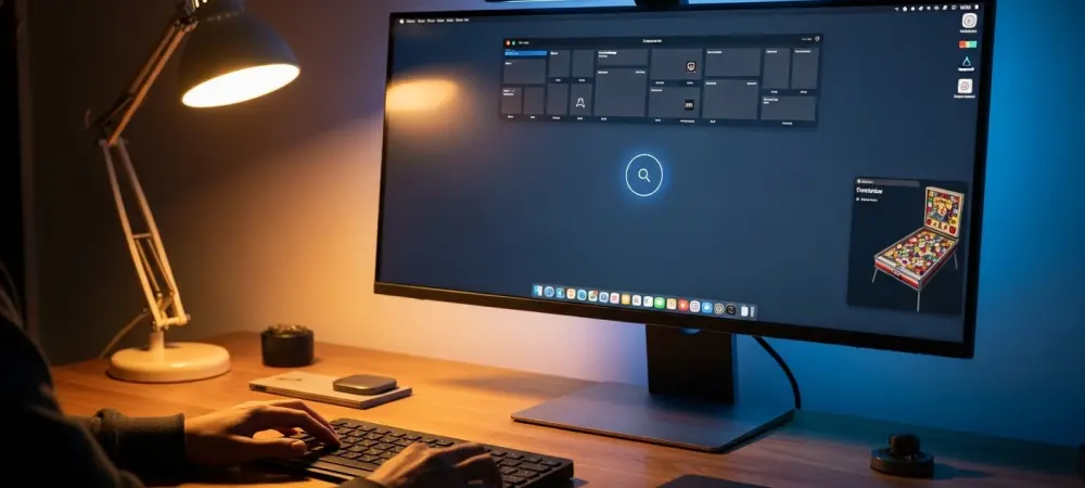
The pitch is not anti-AI; it is pro-clarity. A systemwide dark mode respects XP’s lines, menus keep their order, and 3D Pinball Space Cadet returns with updated polish. The surprise is how modern it looks without performing modernity at every turn.
Why This Story Matters
Windows 11’s big swing has been ambient assistance: Copilot panels, predictive suggestions, and app surfaces that guess intent. For some, that guidance speeds discovery. For others, it raises cognitive load, crowds the taskbar, and introduces new places to dismiss alerts.
Nostalgia explains part of the XP pull, but not all. Users consistently cite clarity, consistency, and speed—values that predate glassy gradients. This concept channels those principles, not just the aesthetic, to argue for a desktop that feels stable under pressure.
Inside the Concept
Addy Visuals’ take lands as visual modernity without visual noise. Subtle shadows and spacing replace skeuomorphic heft, restrained color keeps icons legible, and motion cues are gentle enough to inform, not distract. It reads as contemporary because it is quiet.
Workflows benefit from that calm. Search and launch remain predictable, window management stays tidy, and menus avoid layered suggestion trays. Assistance appears only when asked, which aligns with “calm technology” thinking: help should recede until needed.
Expert Voices and Real-World Friction
UX research from groups like Nielsen Norman Group has long shown that reduced cognitive load correlates with fewer errors and faster task completion. Consistency and recognition over recall make everyday tasks—saving, switching, sharing—feel nearly automatic.
Practitioners echo the cost of constant prompts. As one product lead put it, “Progressive disclosure beats default complexity.” Community reactions to the concept underline the point: dark mode done right eased eye strain, and familiar layouts lowered training time for families and offices.
What To Do Next
A practical path stood out. Use theme presets as ready-made choices, not puzzles; keep one clear entry point for search and launch; and offer global toggles for suggestions, telemetry, and background services with plain-language states. When tasks are ambiguous, data-heavy, or creative, layer in opt-in AI; when they are routine or time-critical, keep the path short.
For enthusiasts today, the closest route leaned on minimalist launchers, trimmed startup items, and a small, well-chosen toolkit instead of sprawling suites. The broader takeaway was simple: refine the shell first, add intelligence second, and let users decide when the desktop should speak.