
Imagine navigating an operating system where every click feels intuitive, every app is just a glance away, and the interface molds itself to your device’s screen with effortless precision. This vision is becoming a reality for Windows Insiders with the latest preview build in the Canary Channel. This roundup dives into the revamped Start Menu and other updates in Build 27965, gathering diverse opinions and tips from tech enthusiasts, developers, and everyday users. The purpose is to explore how these changes are perceived across different communities and what they signal for the evolution of Windows 11.
Gathering Perspectives on Build 27965 Updates
What Tech Communities Are Saying About the Start Menu Redesign
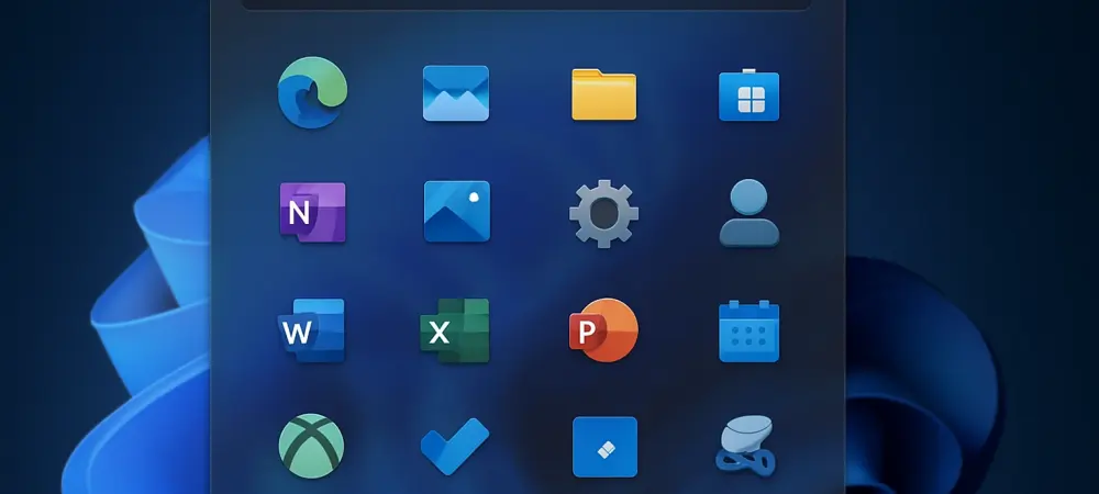
Across various online forums, the redesigned Start Menu has sparked lively discussions. Many users praise the scrollable interface and dynamic adaptability, noting how it scales to display up to eight columns of pinned apps on larger screens while trimming down to six on smaller devices. This flexibility is often highlighted as a major win for those juggling multiple apps daily, especially on diverse hardware like desktops and tablets.
However, not all feedback is glowing. Some community members express concern over the complexity of the new viewing modes—Category view, which groups apps by usage, and Grid view, which organizes them alphabetically. A segment of users worries that these options might overwhelm less tech-savvy individuals who prefer a static, familiar layout over adaptive designs.
Balancing these views, several tech blogs suggest that while the redesign addresses long-standing navigation issues, Microsoft should consider offering a simplified toggle for those who find the new features excessive. This middle-ground opinion underscores a broader call for customization that doesn’t sacrifice simplicity for innovation.
User Feedback on Personalization Features
Diving into personalization, opinions vary on how well the Start Menu remembers preferred viewing modes and optimizes layouts for screen sizes. On social platforms, many users appreciate the tailored experience, citing examples like faster access to tools such as Outlook on a desktop setup compared to a compact tablet view. This adaptability is seen as a step toward a more user-centric design.
Contrasting this, a portion of feedback points to potential clutter. Some users argue that the sheer number of pinned apps and recommendations—up to six on larger displays—can create a visually busy interface, detracting from the intended ease of use. This critique often comes from those who value minimalism over extensive customization.
Tech reviewers chime in with a practical tip: experiment with both Category and Grid views to find a balance between organization and accessibility. They also note that Microsoft’s focus on individual preferences is evident, but question whether the current options fully cater to all user needs or if further refinement is necessary based on ongoing input.
Emerging Tools and Connectivity: Diverse Opinions
Reactions to the New “Edit” Text Editor
The introduction of “Edit,” an open-source command-line text editor within the Terminal app, has elicited mixed responses. Developer communities largely welcome this addition, emphasizing its utility for quick file modifications via simple commands. Many see it as a nod to power users who thrive in technical environments, aligning with industry trends toward developer-friendly tools.
On the flip side, casual users often find this feature niche and inaccessible. Feedback from general tech forums reveals a steep learning curve for those unfamiliar with command-line interfaces, with some questioning whether such tools belong in a mainstream OS update. This divide highlights a tension between catering to specialized audiences and maintaining broad usability.
Insights from tech analysts suggest that while “Edit” may not appeal to everyone, its inclusion reflects Microsoft’s broader strategy to integrate versatile utilities. They recommend that users curious about this tool start with available documentation to ease into its functionality, while acknowledging that its impact may remain limited to a specific user base.
Phone Link Enhancements: Bridging Devices or Widening Gaps?
The updated Phone Link feature, with a mobile device button near the Search box for seamless content management, has garnered attention for its potential to enhance cross-device integration. Many users on discussion boards laud this as a convenient way to sync mobile and desktop experiences, seeing it as a building block for deeper connectivity in future updates.
Skeptics, however, argue that these enhancements cater primarily to a tech-forward crowd already comfortable with such integrations. Comments from less technical users indicate that the feature feels underutilized without clearer guidance on setup and benefits, raising questions about its universal appeal in bridging device gaps.
Tech commentators offer a balanced take, suggesting that while Phone Link shows promise, its success depends on Microsoft’s ability to make it intuitive for all skill levels. They advise users to explore this feature for tasks like photo transfers or notifications, but caution that its full potential might only emerge with further refinements based on community feedback.
Key Takeaways from the Community Pulse
Synthesizing the varied perspectives, the Start Menu overhaul stands out as a polarizing yet promising update, with its scrollable design and adaptive layouts earning both acclaim and critique. Tools like “Edit” cater to a niche audience, while Phone Link updates hint at a connected future, though accessibility remains a concern for some. Across the board, there’s a consensus that Microsoft is pushing toward personalization and functionality, even if the execution sparks debate.
For those eager to weigh in, joining the Insider program offers a direct way to test these features and share input. Experimenting with viewing modes or diving into Phone Link’s capabilities can provide firsthand insights, while community forums serve as a hub for exchanging tips and concerns with fellow users.
Reflecting on the Discussions and Next Steps
Looking back, the discourse around Build 27965 reveals a landscape of excitement tempered by constructive criticism. The Start Menu changes tackle navigation and space usage head-on, though they leave some users seeking simpler alternatives. Meanwhile, features like “Edit” and Phone Link spark conversations about balancing niche innovation with mainstream accessibility. Moving forward, users could benefit from exploring tutorials or community guides to navigate these updates more effectively. Keeping an eye on how Microsoft responds to feedback in subsequent builds will be crucial, as it may refine these features into more polished, inclusive tools. Engaging with other Insiders to share experiences could also uncover hidden tips, ensuring that the evolution of Windows 11 reflects a wide array of needs and preferences.