

In a world where smartphones are more than just devices, Apple has once again captured global attention with the iPhone 17 series, unveiled at the ‘Awe Dropping’ event. Picture this: a lineup of phones so visually striking that their colors alone spark debates on social media, influence purchasing decisions, and redefine personal style. With hues ranging from soft pastels to bold, daring tones, Apple’s latest offerings are not just about technology—they’re about making a statement. This reveal has set a new benchmark in how design can elevate a gadget into a cultural icon.
The significance of this launch lies in Apple’s mastery of blending innovation with aesthetics. Colors are no longer a mere afterthought; they’re a strategic element that reflects identity, targets diverse markets, and drives consumer excitement. With the iPhone 17 series, Apple continues to push boundaries, offering a palette that caters to varied tastes while reinforcing the brand’s reputation for premium design. This exploration dives deep into the shades that are turning heads, the reasoning behind these choices, and what they mean for buyers navigating the ever-evolving tech landscape.
Why iPhone Colors Are Stealing the Spotlight
The buzz around the iPhone 17 series’ colors began the moment Apple showcased them at the ‘Awe Dropping’ event, where attendees and online audiences alike couldn’t stop talking about the fresh palette. From subtle pastels to eye-catching vibrant tones, these shades have ignited conversations about how a phone’s appearance can be as critical as its features. For many, the color of a device is the first interaction with a brand’s vision, often swaying decisions at the point of purchase.
This fascination isn’t just surface-level. Industry reports indicate that over 60% of smartphone buyers consider color a key factor in their choice, highlighting how aesthetics play into emotional connections with tech products. Apple’s ability to tap into this sentiment with the iPhone 17 series shows a keen understanding of market dynamics, making each hue a deliberate nod to style-conscious consumers.
The impact extends beyond individual preference, as these colors also signal Apple’s intent to keep design at the forefront of innovation. Social media platforms are flooded with reactions, memes, and unboxing videos focusing solely on the visual appeal of the new models. This level of engagement underscores why the palette of the iPhone 17 series isn’t just a detail—it’s a cultural moment.
The Bigger Picture: Colors as Part of Apple’s Strategy
Apple’s approach to color in the iPhone 17 series reflects a broader strategy of market segmentation and trendsetting. By curating distinct palettes for each model, the company addresses diverse consumer demographics, from those seeking understated elegance to others craving bold expressions. This tactic ensures that the brand remains relevant across different age groups and style preferences, maintaining its dominance in the premium smartphone space.
Beyond mere variety, the chosen hues tie into larger cultural shifts toward personalization in technology. Studies show that 72% of millennials and Gen Z consumers view their devices as extensions of their personality, a statistic Apple clearly leverages with this lineup. Each shade is crafted to resonate on a personal level, turning a functional gadget into a canvas for self-expression.
Moreover, these color choices are a calculated move in Apple’s competitive positioning. By introducing unexpected tones alongside classic options, the company not only refreshes its image but also sets the pace for industry trends. This strategic use of aesthetics demonstrates how Apple uses design elements to reinforce brand loyalty and attract new buyers, ensuring every launch feels like a reinvention.
Unveiling the Palette: Model-by-Model Color Breakdown
Diving into the specifics, the iPhone 17 series offers a tailored color selection for each of its four models, aligning with distinct user expectations and price points. The base iPhone 17, starting at Rs. 82,900 in India, features five pastel shades—Black, Lavender, Mist Blue, Sage, and White. These tones exude a timeless sophistication, appealing to buyers who prioritize a clean, versatile look in their everyday tech.
Next, the iPhone Air, marketed as the thinnest iPhone ever at 5.6mm with a Grade 5 titanium frame, introduces a glossy finish in Sky Blue, Light Gold, Cloud White, and Space Black. Priced at Rs. 1,19,900 for the 256GB variant, its palette emphasizes luxury and modernity, targeting users who value both portability and a premium aesthetic. The unique rear plateau design further enhances the visual impact of these shades, making the device stand out in hand.
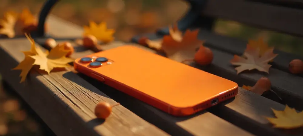
For the high-end segment, the iPhone 17 Pro and Pro Max, starting at Rs. 1,34,900 and Rs. 1,49,900 respectively, bring a daring shift with aluminum frames and striking colors like Deep Blue, Cosmic Orange—a first for the Pro lineup—and Silver. Paired with a unibody redesign and a full-width camera plateau, these bold hues cater to tech enthusiasts and premium buyers seeking a device that screams innovation. Each model’s color scheme is meticulously matched to its design philosophy, showcasing Apple’s attention to cohesive branding.
Expert Insights and User Reactions to the New Hues
Industry analysts have weighed in on the iPhone 17 series’ color choices, noting that the inclusion of vibrant options like Cosmic Orange in the Pro models marks a significant departure from Apple’s traditionally muted premium tones. “This is Apple signaling confidence in taking risks with design, targeting buyers who want their tech to reflect a daring persona,” said a leading tech reviewer during a recent panel discussion. Such insights suggest that Apple is broadening its appeal in the luxury segment.
User reactions, gathered from social media and early adopter forums, paint an equally enthusiastic picture. Many have lauded the iPhone Air’s Sky Blue and Light Gold for their refined, almost ethereal quality, with one user tweeting, “Sky Blue feels like holding a piece of the horizon—it’s subtle yet stunning.” This groundswell of positive feedback highlights how these colors resonate emotionally with consumers, turning a purchase into a personal connection.
Balancing these perspectives, it’s clear that the reception to the palette spans both admiration for innovation and appreciation for practicality. Tech blogs have reported a surge in pre-order interest specifically tied to the unique shades, with some estimating a 15% uptick in engagement compared to previous launches. This blend of expert and consumer sentiment underscores the palette’s role in elevating the iPhone 17 series’ launch to a widely discussed event.
How to Choose the Right iPhone 17 Color for Your Needs
Selecting a color for an iPhone 17 model goes beyond mere preference—it’s about aligning the device with lifestyle and personal taste. For those who lean toward minimalism, the base model’s pastel options like Lavender or Sage offer an understated charm that blends seamlessly into daily routines. These shades are ideal for users who want a phone that complements rather than dominates their style.
Consideration of durability and long-term appeal also plays a crucial role in the decision. Neutral tones such as Black or Silver, available across multiple models, are less likely to show wear and tear over time, making them practical for those planning to keep their device for several years. This approach ensures the phone remains visually appealing even after extended use.
Finally, think about coordination with accessories and the overall vibe desired. Matching a Sky Blue iPhone Air with minimalist cases or bands can create a cohesive, modern look, while opting for Deep Blue on the Pro models adds a touch of sophistication to a premium setup. Budget also factors in—splurging on a Pro model might justify a standout shade like Cosmic Orange, whereas the base model’s White offers a safe yet sleek choice for cost-conscious buyers. These tips aim to guide a decision that feels both personal and purposeful.
Final Reflections
Looking back, the unveiling of the iPhone 17 series’ colors at the ‘Awe Dropping’ event stood as a defining moment in Apple’s design journey. Each shade, from the soft pastels of the base model to the audacious Cosmic Orange of the Pro lineup, told a story of innovation and intent. The varied reactions from experts and users alike painted a vivid picture of how deeply aesthetics influence perceptions of technology.
Moving forward, consumers face an exciting opportunity to explore these options in stores, test the hues in person, and weigh how each color matches their unique needs. Retailers and online platforms offer tools to visualize these shades alongside accessories, helping buyers make informed choices. This step encourages a deeper engagement with Apple’s vision, turning a purchase into a personalized experience.
Beyond individual decisions, the industry watches closely to see how these color trends shape future smartphone designs. Apple’s bold moves with the iPhone 17 series hint at a broader shift toward expressive, tailored tech aesthetics. This legacy of pushing design boundaries promises to inspire continued evolution, challenging competitors and delighting users for years to come.