
In a market saturated with look-alike glass and metal rectangles, smartphone design often feels like an afterthought. Yet, some brands are pushing the boundaries, exploring unique materials, bold colors, and integrated forms. Today, we sit down with Dominic Jainy, an IT professional and technology analyst with a keen eye for the intersection of industrial design and consumer electronics. We’ll be dissecting the design philosophy behind Motorola’s recent devices, exploring their vibrant partnership with Pantone, the engineering behind their durable yet affordable builds, and the strategic thinking that guides their cohesive brand aesthetic.
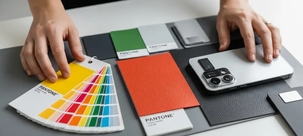
Motorola’s partnership with Pantone brings vivid colors like Corsair and Fluidity to its phones. Could you elaborate on the process of adapting these specific Pantone shades to a textured, vegan leather material, and what are the main design and manufacturing challenges involved?
Translating a specific Pantone shade from a color swatch to a physical product is a complex art, especially with a textured surface like vegan leather. The primary challenge is that the material’s subtle texture interacts with light differently than a smooth, glossy surface, which can alter the perception of the color. The goal is to ensure that a shade like “Corsair” blue looks just as intended under various lighting conditions. To achieve this, Motorola developed a standardized backplate design with a consistent leather-like feel, creating a reliable canvas for these colors. A major manufacturing consideration is achieving this premium look and feel—one that resists fingerprints and feels great to the touch—while keeping the process scalable and cost-effective across their lineup.
The Moto G57 Power features an integrated camera module that curves into the backplate. What specific design and engineering considerations led to this choice, and what are the trade-offs compared to the more common, sharply protruding camera bumps on competing smartphones?
That integrated camera module is a really clever piece of industrial design. The primary consideration was to move away from the harsh, prominent camera bumps that have become so common. Those often feel like an afterthought, something tacked onto the back. By using an elegant curve, Motorola creates a soft, seamless transition between the camera housing and the rest of the phone’s body. Engineering this requires precision molding of the chassis and backplate to flow together. The biggest benefit is aesthetic and ergonomic; it feels more unified and is less likely to snag on a pocket. The main trade-off is that this design might impose some constraints on the internal layout or the thickness of the camera components, but Motorola has managed to execute it without compromising the phone’s slim profile.
Achieving an IP64 rating and a sturdy, flex-free chassis in an affordable device is a notable accomplishment. Can you walk us through the key material choices and structural engineering steps that make this level of durability possible without significantly raising the consumer price point?
It truly is impressive. Achieving that sturdiness and an IP64 rating in a budget-friendly device comes down to smart engineering and material optimization. Instead of expensive materials like titanium or ceramic, the focus is on a well-designed internal frame and a high-quality polycarbonate or composite chassis that provides rigidity without significant cost. The “flex-free” feel we observed during testing points to strong internal bracing and tight manufacturing tolerances, ensuring all the components are securely seated. For the IP64 rating, which protects against dust and water splashes, it’s about meticulous sealing around ports, buttons, and seams using gaskets and adhesives. The key is that none of these steps are individually exotic or expensive, but when combined with precision engineering, they deliver a level of durability that feels far more premium than the price suggests.
Motorola’s design language is highly uniform, sometimes making it difficult to distinguish between models at different price points. What is the strategy behind this cohesive aesthetic, and how does your team balance the benefits of brand consistency against the need for clear model differentiation?
This is a classic branding dilemma. The strategy behind the uniform design language is to establish a strong, recognizable brand identity. When you see that curved camera module and the textured back, you immediately think of a Motorola device. This consistency builds brand equity and gives even the more affordable models, like a Moto G06, a polished and premium feel that borrows from their more expensive siblings. The downside, as you noted, is the difficulty in differentiation. You can have two phones with a $150 price difference, like the G06 and G86, that look nearly identical at a glance. The balance is struck in the details—subtle differences in finish, screen-to-body ratio, or the specific materials used around the frame. It’s a strategic choice to prioritize a consistent brand experience over distinct model-by-model identities.
What is your forecast for smartphone design aesthetics?
I believe we’re moving away from the minimalist, monochrome slab and entering a new era of personality and tactile feedback in design. The work with Pantone on vivid colors like “Peach Fuzz” and “Fluidity” is a leading indicator; consumers want devices that are more expressive. We’ll see a broader exploration of materials that feel good to hold, like textured leatherette, and a move away from fingerprint-prone glass backs. Furthermore, the integration of elements like the camera bump will become more common, with designers focusing on creating a holistic, unified object rather than a collection of parts. The future is colorful, textural, and thoughtfully integrated.