
Picture this: a tool so ingrained in the daily grind of Windows users that it’s almost invisible, yet it hasn’t seen a significant update in years. The Run dialog, accessed with a quick Win+R shortcut, is a quiet workhorse for launching apps and commands. But now, in 2025, Microsoft has decided to breathe new life into this unassuming feature with a modern twist in Windows 11. This subtle yet striking refresh has sparked curiosity among tech enthusiasts and everyday users alike, proving that even the smallest updates can make a big splash in the evolving world of operating systems.
Why This Update Is Turning Heads
The Run dialog’s makeover isn’t just a random tweak—it’s a signal of Microsoft’s commitment to polishing every corner of Windows 11. First spotted in an experimental build by a keen-eyed user known as Phantom Of Earth, this update emerged as a hidden gem in build 26534. What started as a whisper in tech circles quickly grew into a topic of interest, as screenshots and early impressions hinted at a long-overdue transformation of a tool many thought would remain forever unchanged.
Beyond the initial buzz, this refresh sets the stage for a more cohesive Windows experience. The Run dialog, once a relic of older design philosophies, now bridges the gap between legacy interfaces and the sleek, modern aesthetic of Windows 11. While it may seem like a minor detail, such updates carry weight—they signal Microsoft’s intent to eliminate jarring inconsistencies and craft a unified visual language across the OS, enhancing user trust in the platform’s evolution.
The Deeper Significance of a Modernized Tool
Zooming out, modernizing the Run dialog reflects a broader effort to address lingering design disparities in Windows 11. Many core elements still echo the look of Windows 10 or even earlier versions, creating a fragmented user interface. This update is a step toward aligning every component with the fluent design principles that define the current iteration of Windows, ensuring that no tool feels out of place.
Moreover, users today expect a seamless and intuitive experience from their operating systems. The demand for cohesive interfaces isn’t just about aesthetics; it’s about efficiency. By updating everyday tools like the Run dialog, Microsoft responds to these expectations, subtly boosting productivity for power users and casual ones alike. A small change here can ripple into smoother workflows and less friction in daily tasks.
Unveiling the Visual and Functional Overhaul
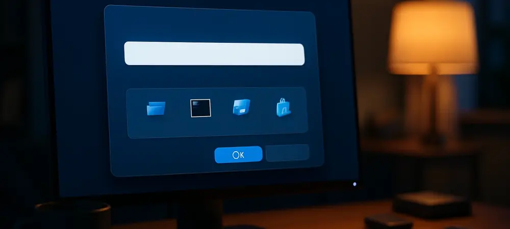
Dive into the specifics, and the updates to the Run dialog reveal thoughtful design choices. Visually, it sports a larger, less cramped layout that prioritizes readability. Elements now have room to breathe, making the interface feel more approachable and less like a throwback to the early 2000s. This refreshed look transforms a utilitarian tool into something that feels current and intentional.
Functionally, the dialog introduces smarter navigation features that elevate its utility. As users type, a list of recent commands appears with accompanying icons, making it easier to spot the right entry at a glance. Drawing inspiration from tools like PowerToys, this addition streamlines access to frequently used actions, turning a basic shortcut into a more dynamic assistant for quick tasks.
When compared to its predecessor, the contrast is clear: the old dialog felt stark and dated, while the new version balances aesthetics with practicality. Users stand to gain not just a prettier interface but a more efficient one, reducing the mental load of recalling commands or navigating clunky menus. It’s a win for usability that punches above its weight.
What the Community Thinks About the Change
Reactions to this update span a wide spectrum within the tech community. Some view it as a purely cosmetic tweak, arguing that the Run dialog was already functional and didn’t need a facelift. Others, particularly early testers and enthusiasts, praise the meaningful enhancements, noting how the larger layout and command suggestions improve their workflow in subtle but noticeable ways.
Interestingly, Microsoft has remained tight-lipped about this feature. No official announcement or timeline has accompanied its discovery, leaving room for speculation about future refinements. This silence fuels curiosity—will this be a standalone update, or is it a precursor to broader interface overhauls? For now, the lack of clarity keeps the conversation alive among Windows watchers.
Getting Hands-On with the New Design
For those eager to try this modernized Run dialog, accessing it requires a bit of tinkering. The feature isn’t enabled by default in the current build; instead, users must navigate to a specific toggle in the Settings menu under System > Advanced, labeled as “Use the modern Run dialog when pressing Win+R.” A few clicks can unlock this experimental update for early testing.
When exploring this feature, it’s important to temper expectations. As an experimental build, it comes with limitations—some elements may feel rough around the edges, and full polish isn’t guaranteed. Testers are encouraged to note their experiences and share constructive feedback with Microsoft, helping shape the final iteration of this tool before a wider rollout.
Reflecting on a Step Toward Consistency
Looking back, Microsoft’s quiet update to the Run dialog stood as a testament to their meticulous approach to refining Windows 11. It tackled a small but symbolic piece of the OS puzzle, blending modern design with practical enhancements. This move underscored a dedication to smoothing out the rough edges of user experience, even in areas often overlooked.
As the tech landscape continued to evolve, the next steps became clear: users and developers alike needed to keep engaging with these updates, testing them, and sharing insights. Microsoft’s gradual rollout hinted at more refinements on the horizon, potentially extending to other legacy tools. Staying attuned to these changes promised to keep Windows 11 not just current, but a step ahead in meeting user needs.