

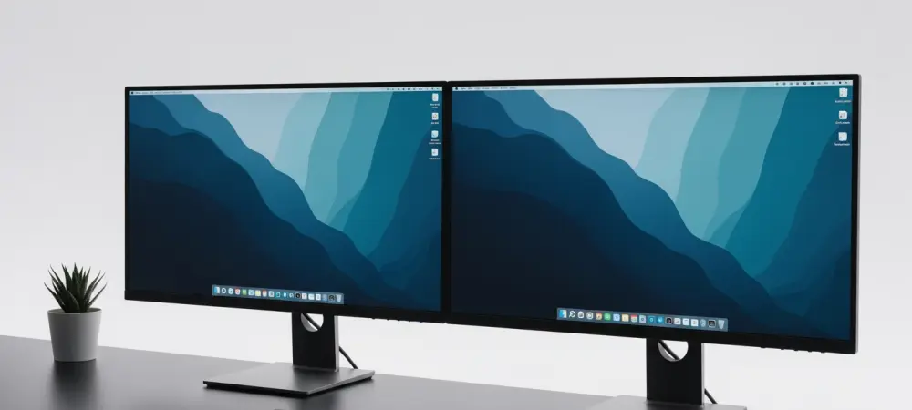
The pervasive nature of digital distractions has fundamentally changed how professionals interact with their workstations, leading many to seek a more minimalist and intentional computing experience. In 2026, the volume of data processed daily is staggering, and the primary interface—the desktop—often becomes a battleground for attention between system alerts and actual tasks. A cluttered screen is not merely an aesthetic concern; it is a cognitive burden that forces the brain to filter out irrelevant information continuously, which eventually results in decision fatigue. Transitioning to a calmer environment starts with the realization that every icon, widget, and notification badge competes for limited mental bandwidth. By asserting control over the operating system’s visual output, users can reclaim their focus and establish a digital space that promotes tranquility rather than anxiety. This systematic approach to refinement allows for a personalized workspace that reflects individual priorities rather than corporate defaults designed to maximize engagement. Reclaiming this digital territory is essential for anyone who values concentration and wishes to mitigate the constant pull of the attention economy.
1. Streamlining the Login Screen
The first point of interaction with any computer is the login screen, an area that often serves as a billboard for news, weather, and miscellaneous trivia. To initiate the process of creating a more serene environment, one must begin by trimming away the unnecessary noise that greets them upon booting the system. The journey toward a cleaner interface starts by launching the Settings app, which serves as the central hub for all system modifications. From the main menu, the Personalization category offers the necessary tools to adjust the visual aesthetic of the environment. Within this section, accessing the Lock screen menu on the right allows for direct control over what appears before the user even enters their credentials. By deactivating the Widgets toggle, the system stops the influx of dynamic content that can often feel like a barrage of irrelevant information at the start of the workday.
Beyond simply removing active widgets, further refinement is required to ensure the lock screen remains a static and peaceful entry point. This involves looking deeper into the settings to turn off the option for suggested widgets on the login screen, preventing the operating system from re-introducing distractions under the guise of helpful recommendations. To establish a truly consistent and calming visual theme, one should look under the personalization settings for the lock screen and choose the Picture or Slideshow mode. This manual selection replaces the rotating “Windows Spotlight” images, which often include interactive text and links that invite clicking rather than focusing. After selecting the preferred mode, the final step is to pick the specific image that matches the desired mood. Whether it is a minimalist landscape or a solid color, having a predictable and intentional background sets a professional tone for the entire computing session.
2. Hiding Widgets from the Taskbar
The taskbar is arguably the most valuable piece of real estate on a computer screen, yet it is frequently crowded with icons that serve little purpose for the average professional. One of the most prominent sources of visual clutter is the integrated widgets button, which often displays a shifting array of icons and weather updates that can be distracting during intense focus periods. To address this, the process begins again in the Settings app, where the primary configuration for the user interface is located. Selecting the Personalization category provides the specific pathways needed to alter the behavior of the desktop’s most visible elements. By accessing the Taskbar menu on the right, the user gains the ability to toggle various system icons that are pinned by default but might not be essential for daily operations.
Refining the taskbar involves a deliberate choice to prioritize utility over constant connectivity. Within the Taskbar menu, the user will find the Taskbar items area, which lists several integrated features that can be enabled or disabled at will. Removing this single element can significantly reduce the amount of movement and color in the peripheral vision, allowing the eye to stay centered on the primary work application. This change does not remove the functionality entirely from the system but rather moves it out of the immediate line of sight. Maintaining a clean taskbar ensures that only the applications currently in use or those strictly necessary for navigation remain visible, fostering a sense of order and control over the digital environment.
3. Silencing Alerts with Do Not Disturb
Every alert, regardless of its importance, triggers a brief cognitive shift that can take several minutes to recover from, making notification management a priority for any professional. To silence these interruptions, one must navigate to the Settings app and select the System category, where core operational behaviors are managed. Accessing the Notifications menu on the right opens up a suite of options designed to filter the information that reaches the user. While notifications are intended to keep users informed, the sheer volume of alerts from various applications can quickly become overwhelming and counterproductive to the goal of maintaining a calm and focused digital workspace.
Managing the flow of information requires using tools that can act as a shield against the digital noise. Within the notification settings, one should switch the Do Not Disturb toggle to the off position, ensuring that the system does not bypass the user’s intent for silence during critical hours. It is important to realize that a silent machine is often a more productive machine, as it allows the user to check updates on their own terms rather than being prompted by a sound or a pop-up. For those who require an even higher level of isolation, there is the optional step to deactivate the main Notifications toggle entirely. This extreme measure effectively mutes the entire system, providing a distraction-free zone that is ideal for complex problem-solving or creative tasks. By taking these steps, the computer becomes a tool that serves the user’s schedule rather than a device that demands attention at every possible moment.
4. Removing Suggested Content from the Start Menu
The Start menu is the gateway to every application and file on the system, but it has evolved to include “recommendations” that often feel like digital clutter. These suggestions, which include recently installed apps and frequently used files, can make the menu feel disorganized and cluttered with items the user may not currently need. To reclaim this space, the user should launch the Settings app and head to the Personalization category once again. Accessing the Start menu page provides the necessary controls to prune the list of visible items and focus the interface on what is truly important. By deactivating the toggle for showing recently installed applications, the menu becomes more predictable and less prone to shifting its layout every time a new tool is added to the system.
Further customization of the Start menu involves stripping away the layers of “helpful” suggestions that the operating system provides by default. This means turning off the setting for recommended files in the Start menu, File Explorer, and Jump Lists, which prevents the system from displaying a history of documents that might not be relevant to the current task. Additionally, deactivating the toggle for suggestions regarding tips, shortcuts, and new applications ensures that the interface remains a clean tool for navigation rather than a discovery platform. For those who want the absolute minimum amount of visual noise, there is also the option to turn off notifications related to the user account to stop alerts in the user menu. These changes result in a Start menu that is focused purely on the applications the user chooses to pin, providing a fast and efficient way to launch programs without being distracted by algorithmic suggestions.
5. Eliminating Web Highlights in Search
The search function is a critical component of navigating a modern operating system, yet it has become a vehicle for displaying web-based content and highlights that can distract from local file discovery. When a user opens the search bar to find a specific document, they are often met with trending news, daily images, and web links that have nothing to do with their immediate query. To fix this and return search to a purely functional state, one should open the Settings app and select the Privacy & security category. From there, accessing the Search permissions page on the right reveals the settings that govern how the search interface interacts with the broader web and what information it displays before a query is even typed.
The goal of a calm desktop is to ensure that every tool performs its primary function without adding unnecessary peripheral information. Within the search permissions, the most impactful change is to deactivate the toggle for showing search highlights. By eliminating these web-based distractions, the search tool becomes faster and less cluttered, ensuring that the user can find what they need without being sidetracked by the latest news or internet trends. By eliminating these web-based distractions, the search tool becomes faster and less cluttered, ensuring that the user can find what they need without being sidetracked by the latest news or internet trends. This refinement reinforces the idea of the computer as a purposeful instrument rather than an extension of the social media ecosystem. Reducing the search interface to its core essentials helps maintain a clear mental path between the intention to find a file and the actual execution of that task.
6. Turning Off Notification Dots on Taskbar Icons
Small visual cues like notification dots, often referred to as badges, are specifically designed to capture the user’s attention and prompt an immediate reaction. While they are useful for indicating unread messages, they can also create a persistent sense of urgency that is often disproportionate to the actual importance of the notification. To remove these tiny but powerful stressors, one must navigate to the Settings app and choose the Personalization category. Accessing the Taskbar menu on the right allows for deep customization of how application icons behave when they are pinned or active. These small red or white dots can be a constant source of “micro-distractions” that pull the eye away from the center of the screen and toward the periphery, breaking the flow of a productive session.
Eliminating these badges requires expanding the Taskbar behaviors menu, which contains the more advanced settings for taskbar interaction. Within this section, the user should uncheck the option to show badges on taskbar applications. Once this is done, the icons will remain clean and static, regardless of how many unread emails or messages are waiting in the background. This approach encourages a more intentional way of working, where the user decides when to check for updates by opening the application, rather than being constantly reminded of a growing backlog. By removing the visual “nagging” of notification dots, the taskbar becomes a neutral zone that supports a calm and focused workflow. It allows the user to stay immersed in their current task without the nagging feeling that something else requires their immediate attention, ultimately leading to a more satisfying and less stressful workday.
7. Clearing Files and Icons from the Desktop
The physical desktop of a desk is often a reflection of one’s organizational state, and the same logic applies to the digital desktop that serves as the background for all computer activities. Many users fall into the habit of saving every temporary file, shortcut, and download directly to the desktop, leading to a grid of icons that obscures the wallpaper and creates visual chaos. A truly calm environment is one where the desktop is kept entirely clear, allowing the chosen background image to provide a sense of space and tranquility. To achieve this without manually deleting every file, a simple system-wide command can be used. By right-clicking on any empty space on the desktop, a context menu appears that offers various viewing and organization options for the current workspace. The final step in creating a minimalist digital sanctuary is to hide the visibility of all desktop items, effectively giving the user a clean slate. Within the right-click menu, the user should hover over the View menu to reveal a sub-list of display settings. Clicking on the “Show desktop icons” option to uncheck it will immediately hide every item on the desktop, from folders to shortcuts. This does not delete the files; they remain accessible through the File Explorer, but they are no longer visible on the main screen. This simple change has a profound psychological effect, as it removes the immediate visual evidence of a “to-do” list and provides a clean, open space that is free from clutter. With the icons hidden, the desktop becomes a serene backdrop that supports a clear mind, allowing the user to start each session with a sense of calm and focus that is unburdened by a messy digital environment.
8. Optimizing Digital Workspaces for Sustained Focus
The transition toward a more intentional and minimalist digital environment was completed through a series of deliberate configuration changes that prioritized user focus over system-generated noise. By systematically addressing the login screen, taskbar, notifications, and the Start menu, the workstation was successfully transformed into a tool that fosters productivity rather than distraction. These adjustments provided a blueprint for managing the complex relationship between modern software features and the human need for a quiet workspace. The removal of badges and web-based highlights specifically targeted the micro-distractions that often eroded mental energy throughout the day, while clearing the desktop icons established a permanent sense of digital order.
Moving forward, the maintenance of this calm environment required a shift in how new applications and files were integrated into the daily routine. The steps taken ensured that the operating system no longer dictated the pace of information flow, putting the user back in control of their digital experience. It became clear that a minimalist interface was not about losing functionality, but about gaining the clarity needed to use that functionality more effectively. Professionals who adopted these strategies found that their ability to sustain deep work improved, as the visual and auditory cues that previously triggered task-switching were largely eliminated. This proactive approach to interface design served as a vital foundation for achieving peak performance in an increasingly connected world.