
As customers spend more hours attached to their smartphones every day, they are more likely than ever to discover your ecommerce website on a small screen. It doesn’t matter if they are drawn to your website through an Instagram ad, a TikTok influencer’s glowing review, SMS promotional texts, or push notifications for in-app surveys. Each of these entry points emphasizes the need for a seamless mobile customer experience. Ensuring a smooth customer journey from clicks and swipes to cart additions and checkouts is not just beneficial but necessary for thriving in the current ecommerce landscape.
Steer Clear of Instant Pop-Ups
Pop-ups on mobile devices can be particularly frustrating for users, given the limited screen space available. Unlike desktop browsing, where a large pop-up is manageable, on mobile, these often take over the entire screen, making them difficult to close and derailing the user’s first impression of your brand. Instead of showing a pop-up immediately, give visitors time to explore your site before presenting an offer. Ideally, this should happen only after they’ve viewed a few pages or spent at least 30 seconds browsing.
This approach allows users to familiarize themselves with your offerings without feeling pressured or annoyed right from the start. For example, the cookware brand Our Place executes this strategy effectively. Their site-wide discount offer appears after shoppers have had some time to browse their collection, ensuring the pop-up enhances rather than disrupts the user experience. The key is timing and presentation—offering a prominent yet easy-to-dismiss “X” ensures that the pop-up does not become a hindrance.
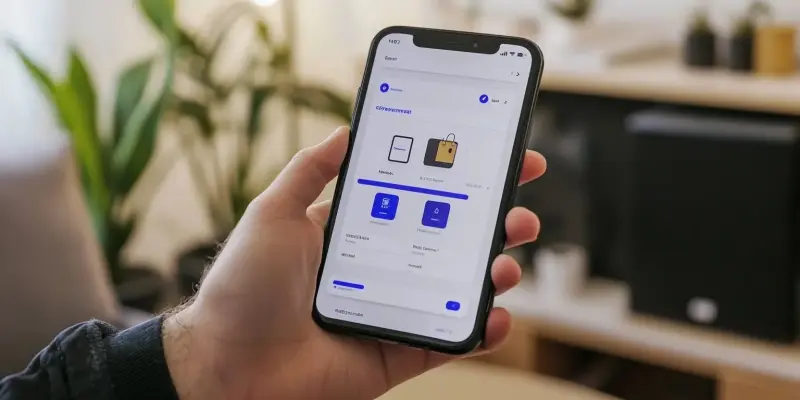
Enhance Your Primary Menu
The expanding hamburger menu with three horizontal lines has become a staple of mobile navigation, but getting it right involves striking a balance between function and design. While it’s essential to keep the menu condensed and thumb-friendly, don’t stop at basic text links. Enhance your primary menu by incorporating elements like product photography, icons, or color to make browsing more engaging and intuitive.
For instance, Brightland, a premium olive oil brand, integrates product imagery within its menu items. This thoughtful addition helps users better understand the product range while browsing, making the menu itself a mini product showcase. By pairing each menu item with elegant product photography and subtle animation, Brightland transforms a basic navigation tool into a visually appealing and informative element, which significantly enhances the mobile shopping experience.
Implement Auxiliary Sliding Menus
In mobile design, vertical scrolling is typically emphasized, but horizontal navigation can be a clever way to expand your screen real estate. Auxiliary sliding menus allow you to keep your main menu concise while offering deeper category exploration through side-to-side swiping. Where customers need quick filtering options—like size, color, or style—turning these into swipeable horizontal menus can speed up product discovery and enhance user experience.
For example, Ruggable, a company specializing in washable rugs, applies this tactic in its mobile navigation. When users select “Shop Rugs” from the main menu, they can swipe through a secondary menu with photos to quickly filter by size. This horizontal layout makes size selection more intuitive and preserves valuable vertical space for browsing products. By using icons and visuals in these auxiliary menus, shoppers can rapidly scan their options, making the shopping process more efficient and enjoyable.
Highlight Support Options
When mobile shoppers encounter an issue, they want immediate help, and often abandon their cart if support isn’t easily accessible. To prevent this, position your chat widget prominently in the bottom corner of the mobile screen, ensuring it remains always visible but never intrusive. Select a widget that collapses to a small icon when not in use and loads quickly on mobile connections.
Beyond visibility, make your support hours clear when customers tap to open the chat, so they know when to expect a response. For example, Brooklinen offers this seamless help experience, enabling customers to switch to text messaging for support, which caters to users’ preferences for native messaging over web-based chat. By meeting customers on their preferred communication channels, you create a frictionless support experience that encourages cart completion rather than abandonment.
Streamline Filtering and Sorting
Mobile shoppers want to narrow down their options quickly when they move from casual browsing to serious consideration. Making filtering and sorting intuitive with clear categories, thumb-friendly buttons, and the ability to apply multiple filters simultaneously is key to a positive user experience. Additionally, providing visual cues and helpful descriptions can guide shoppers, especially for product-specific attributes like size or use case.
For instance, Allbirds, known for its sustainable footwear, effectively simplifies filtering on mobile. Their size selector features large, easy-to-tap buttons with guidance about sizing, while a “Best For” filter quickly helps users find the perfect shoes for their needs, such as everyday wear or wet weather conditions. This kind of streamlined filtering and sorting makes the shopping experience more user-friendly, encouraging shoppers to make confident and informed purchase decisions.
Display Recently Viewed Items
Personalization is critical for ecommerce, and it is no different for mobile users. Since shoppers often browse in shorter bursts between other tasks, it’s important to show them what they’ve previously considered. Displaying recently viewed items allows them to quickly return to products they were interested in without endless scrolling or repeated searches.
Keep a compact row of recently viewed items consistently visible as customers browse. This not only helps them jump back to products they were considering but also improves the chances of them completing a purchase. The ease of access to previously viewed items is particularly useful for shoppers who are comparing similar products and may want to revisit their options quickly before making a decision.
Allow Native Sharing
Mobile phones are now central to modern word-of-mouth marketing, enabling shoppers to share product finds directly from their mobile site. Users seek to quickly share items through social media, group chats, or messaging apps without leaving the site. Adding native share buttons to product pages facilitates this process by connecting to various mobile sharing options.
Prominent share buttons allow customers to send items through channels like WhatsApp, email, or social media directly from the product page. These buttons should be placed beside product images where they are easy to spot and tap, making the sharing process intuitive. By promoting easy sharing, you amplify your reach and embed your brand in the daily digital interactions of your customers.
Present Shipping Details Upfront
Unlike desktop users, mobile shoppers want immediate access to important information without navigating through several pages. Displaying shipping details upfront, particularly on product pages and in the shopping cart, ensures transparency and helps users make quick purchase decisions.
For instance, Brightland embeds shipping expectations directly into their cart with a clear “Usually Ships Within 48 Hours” message and a progress bar toward free shipping. Gymshark also presents shipping details directly on product pages, showing standard delivery times and the free shipping threshold, making it easier for shoppers to understand shipping policies without disrupting their browsing experience. Providing this transparency on mobile fosters trust and reduces cart abandonment due to uncertainty.
Incorporate Video and Zoom Views
Mobile users need intuitive ways to examine products up close, especially when color and texture are crucial factors in their decision-making. Adding detailed product imagery and video content directly to mobile product pages bridges the gap between online browsing and in-store shopping.
For example, Rare Beauty, Selena Gomez’s cosmetics brand, incorporates swatches, zoom-enabled product shots, and short video clips throughout its makeup collection. These visual elements allow mobile shoppers to assess the true color, finish, and texture of products, creating a more immersive and informative shopping experience. By providing detailed views and videos, you give customers the confidence needed to make online purchases sight unseen.
Gather Mobile Feedback
Gathering mobile feedback is crucial to understanding how well your site meets the needs of mobile users. Users are now more likely than ever to find your ecommerce website on a small screen. Whether they come across your site through an Instagram ad, a TikTok influencer’s recommendation, SMS promotional messages, or push notifications for in-app surveys, the importance of a flawless mobile customer experience remains consistent. Each of these entry points underscores the necessity for a smooth and user-friendly journey.
It is not merely beneficial but essential for a successful ecommerce business to ensure everything—from clicks and swipes to adding items to the cart and completing checkouts—happens effortlessly. A positive mobile experience can significantly influence customer satisfaction and retention. This means optimizing your site for mobile devices, ensuring fast load times, intuitive navigation, and a streamlined checkout process.
In today’s competitive landscape, where customers have high expectations and numerous alternatives, a seamless mobile experience can set your ecommerce business apart. Investing in mobile optimization is not a luxury; it’s a critical component for staying relevant and profitable. Businesses that prioritize and perfect their mobile user experience will not only attract but also retain customers, securing a prosperous future in the ever-evolving world of ecommerce.