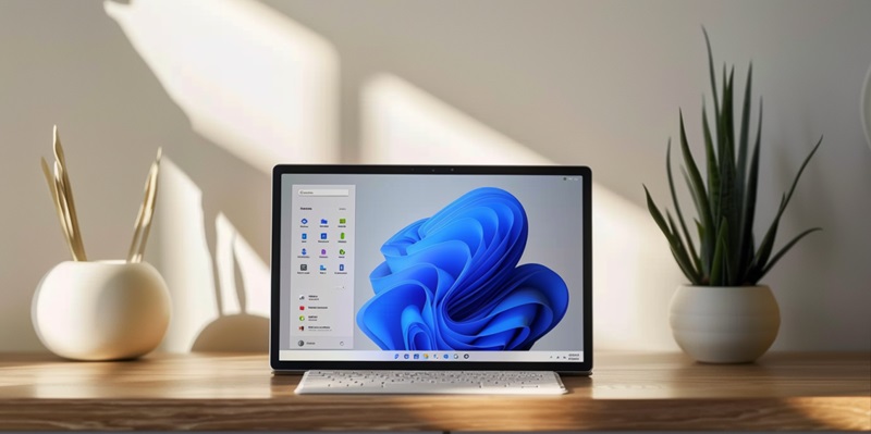
Microsoft has made strides in enhancing Windows 11 with an updated feature that significantly improves the user interface—the revamped All Apps menu in the Start Menu. Originally, in Windows 10, users encountered an alphabetical directory where each program occupied a separate line surrounded by considerable blank space, which garnered criticism for its inefficient use of space. However, Microsoft has listened to feedback and opted for a reimagined layout. The new design moves away from the minimalistic approach and infuses practicality by reducing wasted space, aiming to offer a more functional and user-friendly experience. This change reflects Microsoft’s attentiveness to user needs and its commitment to evolving Windows 11 into an operating system that embodies contemporary design philosophies and usability standards. The redesign is a part of the ongoing efforts to make Windows 11 not only aesthetically pleasing but also more intuitively navigable, keeping pace with the evolving expectations of its diverse user base.
Redesigning Efficiency
The revamp seeks to optimize the Start Menu real estate by replacing the list view with an icon grid synonymous with the mobile app drawer aesthetic. Each application is depicted by an icon alongside its label, facilitating identification and quick navigation. This results in a significant reduction in whitespace and enables multiple apps to be within immediate view. Critics, however, raise concerns on a different front—potential clutter due to the volume of icons and labels now sharing screen space, potentially overwhelming for some users. One must consider that this is a beta-stage innovation and adjustments may well be on the horizon.
Further customization options are being tested by Microsoft to address user feedback and foster a Start Menu that provides both functionality and visual appeal. The precise balance between density of information and clarity of interface remains a cornerstone of UI/UX design, which Microsoft aims to ace with this redesign. The company’s decision to debut this feature in Beta builds exclusively implies careful yet progressive steps in gathering user sentiment and ensuring a system that aligns with diverse preferences before a widespread launch.
Implementation and User Response
Users keen to explore the new Windows 11 layout can do so by installing the KB5035953 update and the latest ViVeTool version. Once these are in place, activating the updated design is a simple command prompt action away. These early adopters are essential to Microsoft, providing invaluable feedback that helps refine the interface ahead of its wider release.
For those less inclined toward the fresh design, reverting to the old view remains an option, ensuring user comfort isn’t sacrificed for the sake of innovation. Microsoft’s receptiveness to user feedback suggests a balanced approach to design, weighing traditional usability with modern aesthetics and functional upgrades.
As this feature transitions out of Beta, the broader Windows 11 community’s reaction will be pivotal. It will not only test Microsoft’s design choices but also indicate whether the All Apps redesign aligns with the diverse needs and preferences of its user base.

