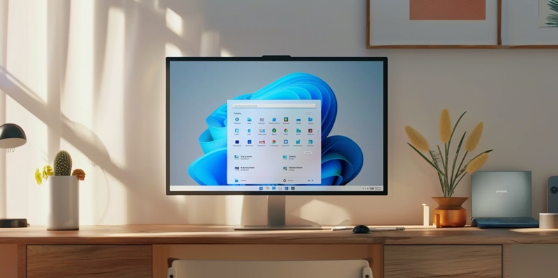
The evolution of software development emphasizes the creation of functional solutions enhanced by a compelling user experience. Microsoft exemplifies this trend with updates to Windows 11, directed by extensive user feedback. Focusing on interactivity and ease of use, significant updates have been implemented in areas like the Taskbar Widgets, which have been tailored for more seamless information access and personalization. Additionally, Microsoft has revamped File Explorer to provide a more intuitive navigation experience, ensuring that users can manage and access their files with greater efficiency.
These refinements are indicative of Microsoft’s commitment to delivering an OS that is both powerful and user-friendly. The adaptability and responsiveness of Windows 11 to customer feedback underlines the ethos of user-centric design in software development. As Microsoft continues to refine its operating system, the tech community watches, taking note of how such enhancements can influence user satisfaction and productivity in both personal and professional computing contexts.
Taskbar Widgets Refined
Accessibility and Visibility Improvements
Microsoft has shifted the position of Widgets closer to the system tray, a strategic move aimed at enhancing their visibility and ease of access for users. The prior placement of Widgets was criticized for being too obscure, often necessitating unnecessary additional steps to locate or simply being overlooked as they were too integrated into the taskbar. This adjustment is geared towards fostering a more intuitive and regular engagement with Widgets. By positioning them more prominently, Microsoft encourages users to take advantage of the personalized information and features Widgets are developed to deliver. The intention is to streamline user interaction with these elements, reducing the friction that may have previously deterred their use. This change reflects Microsoft’s ongoing efforts to refine the user experience, ensuring that the tools provided are not only functional but also readily at hand when needed. Such user-centric alterations are a response to feedback and user behaviors, illustrating Microsoft’s commitment to evolving its interface in ways that align with customer needs and preferences.
Overcoming Integration Challenges
The recent software update was designed with the aim of improving the overall user experience. However, it has inadvertently introduced several issues that have affected its usability. Users have reported experiencing difficulty with the swipe feature, which is not performing as seamlessly as it had previously. Additionally, there are problems with the functionality of widgets; in particular, users are finding it challenging to unpin them when needed. Another issue that has surfaced is the erratic refreshing of the taskbar, which disrupts the flow of use.
These glitches highlight the critical role that thorough testing and the collection of user feedback play in the process of software development. It is through these procedures that potential issues can be identified and resolved, leading to a more polished end product. As the software team works to resolve these bugs, the hope is that users will soon be able to enjoy the intended enhancements without further inconvenience. Until then, these technical hiccups serve as a reminder of the complexities involved in creating user-friendly systems that operate smoothly and meet the high expectations of their users.
File Explorer’s Familiar Functionality
Drag-and-Drop Feature Restoration
In response to widespread user feedback, Microsoft has reintroduced the drag-and-drop feature in the File Explorer’s breadcrumb bar, reflecting their attentiveness to customer needs. This feature, which was sorely missed by many, allows for seamless navigation and management of files by facilitating the dragging and dropping of items to different locations directly within the breadcrumb path. It is a testament to how Microsoft values the input of its user base and is willing to make adjustments to enhance the user experience. The feature’s absence had caused frustration among users who rely heavily on intuitive file management for efficient operation. With its restoration, Microsoft has demonstrated their dedication to user satisfaction and their openness to reinstating beloved features when they are notably missed. This move showcases Microsoft’s iterative approach to software development, constantly improving their systems based on user interaction and feedback.
Adhering to User Feedback
The reintroduction of this feature also symbolizes a broader company ethos of being adaptable and responsive to user input. Instead of dictating how the workflow should evolve, Microsoft shows a willingness to maintain features that users have grown accustomed to and find efficient. This adherence to user feedback is becoming a hallmark of Microsoft’s software development ideology, pointing towards a more intuitive and customizable future for Windows.
In summary, the latest modifications to Windows 11’s Taskbar Widgets and File Explorer demonstrate a pivot towards a user-driven design philosophy within Microsoft. By heeding feedback and improving the user experience, albeit with a few ongoing issues, the tech giant sets the tone for a more democratic approach in future updates. It underscores the critical importance of a company’s ability to adapt and respond to constructive criticism in the ever-evolving landscape of technology.

