

Introduction
The primary objective of this discussion is to analyze recent modifications to the Windows 11 operating system that prioritize a cleaner aesthetic over information density. By examining the transition from a widget-heavy interface to a streamlined appearance, this guide provides clarity on what users should expect from their devices.
The scope of this article covers technical updates released in late August and the customization options available for those who wish to maintain control over their environment. Understanding these shifts helps individuals navigate the evolving landscape of software design without feeling overwhelmed by sudden layout changes.
Key Questions regarding the Visual Update
Why did Microsoft Decide to Simplify the Lock Screen?
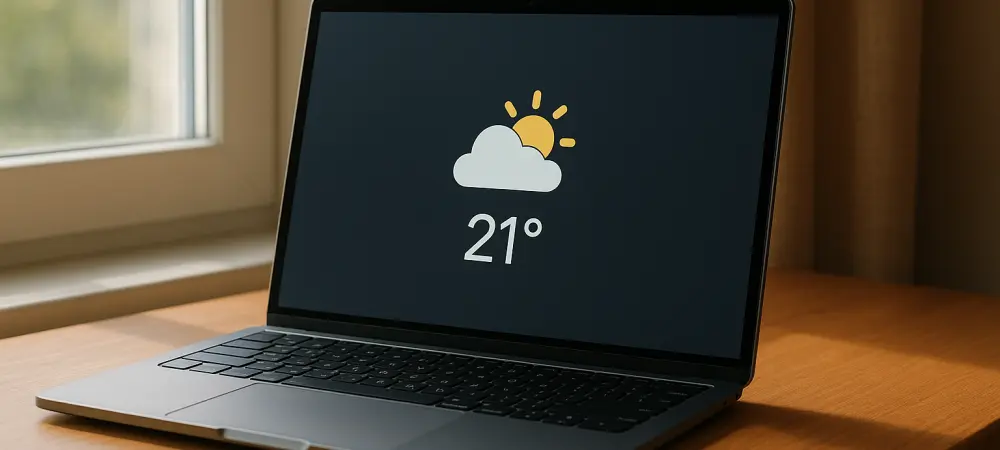
For a considerable period, many individuals voiced significant frustration regarding the busy nature of the lock screen. The interface was pre-populated with various information panels that were often perceived as intrusive or irrelevant to the daily needs of a professional user. The shift toward a quieter look addresses the problem of feature creep where unnecessary visual noise detracts from the core experience. By focusing on a single item like the weather, developers have moved to balance essential information with a professional design language that respects user attention.
What Specific Updates Triggered these Changes to the User Interface?
The transformation was facilitated through specific system updates, notably the release of KB5120998 followed by the mandatory KB5124008 in the current year. These packages modified the default behavior of system widgets to ensure the initial view upon booting remains focused on a singular theme.
These adjustments were not initially highlighted in the primary release notes, resulting in a quiet rollout that was only clarified in updated documentation later. This move suggests a subtle approach to refining the operating system where the focus remains on the gradual improvement of the user journey.
How can Users Maintain Control over Their Lock Screen Personalization?
While the default setting has shifted toward minimalism, the operating system maintains flexibility for personal preference. Users who appreciated the previous layout can manually re-insert specific widgets through the personalization menu, ensuring the system still caters to those who rely on high information density.
Conversely, individuals seeking an even more sterile environment have the option to disable the weather widget entirely. This dual approach allows for a customized balance between functionality and simplicity, ensuring the software remains adaptable to various professional and personal contexts.
Summary of the Interface Shift
This movement represents a significant pivot in how system designers view the lock screen, treating it as a functional gateway rather than a space for data aggregation. The reduction of visual clutter serves to make the platform more appealing to the average user who prefers not to navigate complex settings. The updates introduced throughout the current year prioritize a focused experience while preserving the ability for power users to tailor their devices. This balance ensures that the operating system remains modern and professional as it evolves to meet the needs of a diverse global audience.
Final Thoughts on the Minimalist Trend
The decision to declutter the lock screen signaled a maturation of the Windows 11 design philosophy. It demonstrated a willingness to listen to the community and address the aesthetic fatigue caused by previous iterations of the software.
Moving forward, users might consider auditing their notification and widget settings to further enhance mental clarity during work sessions. Evaluating these small interface changes revealed larger trends in how modern technology aims to integrate more seamlessly into daily routines without adding unnecessary stress.