

Meeting decks overflowed with Gantt bars, burn charts, and traffic lights, yet decision makers still left unsure whether the combined plan would hold under pressure when headcount tightened, milestones converged, or budgets flexed midquarter. The problem sat in plain sight: portfolios had data in abundance but lacked the visibility to judge viability across the whole slate of work. Status celebrated completed tasks while steering demanded a different lens—one that exposed confidence, constraints, and credible options. Treating dashboards as decision instruments changed the cadence of review rooms; instead of chasing explanations, leaders tested scenarios, made trade-offs, and walked out with actions. To get there, governance shifted from one-size-fits-all visuals to a compact set of purpose-built views that filtered noise, elevated signal, and synchronized discussions to a shared source of truth.
The Challenge: Why Dashboards Miss Portfolio Decisions
On-time reports created the illusion of control, but portfolio forums still felt unresolved because the information aimed at activity rather than viability. A green wall of task statuses offered little insight into whether the aggregate plan could survive a surge in dependencies or a slow bleed of capacity in scarce roles. Meetings gravitated to narrative detail—root causes, issue histories, percent complete—while the pivotal questions went unanswered: Is the timetable still realistic, where will pressure crest, and what options exist before choices disappear? Without early warnings, organizations discovered conflicts late, when only blunt instruments remained, such as blanket deferrals or budget freezes that derailed strategic intent. The cost of noise was not just time; it was narrowing flexibility precisely when flexibility mattered most.
Behind that pattern sat structural gaps. Data flowed from heterogeneous tools, refresher cycles were misaligned, and rollups stitched together inconsistent definitions of health or risk. As a result, time was burned reconciling numbers instead of governing outcomes. Worse, dashboards often lacked thresholds that triggered directional debate; absent clear signals, leaders hesitated, fearing that an intervention would be premature. This dynamic turned portfolio reviews into reporting rituals, rewarding comprehensive updates over decisive steering. The remedy did not require more information but better framing. By centering dashboards on decisions, trimming operational detail, and aligning to the cadence of funding and capacity gates, governance moved from explanation to execution and reclaimed the lead time needed to shape the plan rather than suffer it.
Focused Views That Govern: Executive, Capacity, and Financial
The notion of a single master dashboard promised simplicity but delivered confusion, because no solitary frame could answer strategic alignment, delivery feasibility, and financial sustainability at once. A compact suite of purpose-built views changed the conversation. Executive dashboards distilled confidence in outcomes, spotlighted misaligned bets, and marked hotspots that warranted attention, with drill-downs available without tipping into operational reviews. Resource and capacity views tested feasibility by comparing demand to supply over time, revealing timing collisions that raw effort totals hid. Financial dashboards tracked trends and drift, challenging funding assumptions early enough to reset scope, cadence, or priority before pressure hardened into cuts. Together, these views created a shared map for decision-making rather than a scrapbook of progress snapshots.
Consider a portfolio board reviewing a quarterly pivot. The executive view flagged a dip in delivery confidence tied to two interlocked initiatives. A quick pivot to capacity exposed a role-based bottleneck in solution architecture peaking in the same window, while the financial view showed a gentle spend drift across several workstreams, hinting at structural underestimation. Instead of retelling project stories, the group explored scenarios: deferring one initiative by six weeks, swapping a dependency to decouple schedules, and rebalancing discretionary features to relieve the bottleneck. The dashboards stayed sparse, visualized thresholds, and made consequences legible. Because each view spoke to a distinct decision, the meeting stayed focused, explored options in sequence, and ended with a clear, defensible path forward.
Signals That Matter: Metrics for Predictive Steering
Directional, predictive metrics powered this shift from explanation to action. A portfolio delivery health indicator, built as a compound of schedule confidence, dependency exposure, and resource stability, made viability visible in one glance. Capacity gaps over time illuminated future months where demand outpaced supply even if the near term looked calm, preserving options for resequencing or temporary augmentation. Role-based utilization risk surfaced scarcity where it hurt most—architects, data engineers, or field specialists—guiding targeted trade-offs rather than blanket freezes. These signals framed discussions around what could still be changed rather than what had already gone wrong.
Financial indicators carried the same forward tilt. Portfolio spend drift tracked many small variances that, together, nudged the plan off course, prompting incremental corrections before variances calcified into overruns. Forecast reliability measured how estimates aged—schedule slippage patterns, budget variance trajectories—and, over time, built a feedback loop that nudged behaviors toward realism. When these metrics shared a single data backbone and refreshed to match the governance rhythm, trust grew. In practice, tightening the metric set improved clarity: fewer dials, stronger thresholds, and trend lines that stayed visible across cycles. The result was not prettier dashboards but decisions that landed sooner, with fewer surprises downstream.
Design to Decision: Principles and Practice With proMX 365
The design principles were pragmatic. Start with decisions, not datif removing a widget would not change an outcome, it did not belong on the screen. Run on a single source of truth to keep time in the room focused on trade-offs, not reconciliation. Elevate signals over activity so the executive view stayed sparse, while operational detail lived within project tools. Tailor frames to roles so PMOs, portfolio managers, and executives reviewed the same data organized around different questions. Align refresh rates to the cadence of funding checkpoints and capacity gates, accepting that timely and good-enough beat late and perfect. Finally, treat dashboards as living instruments: prune low-value elements, raise or lower thresholds as governance matured, and let real usage drive evolution rather than hypothesis.
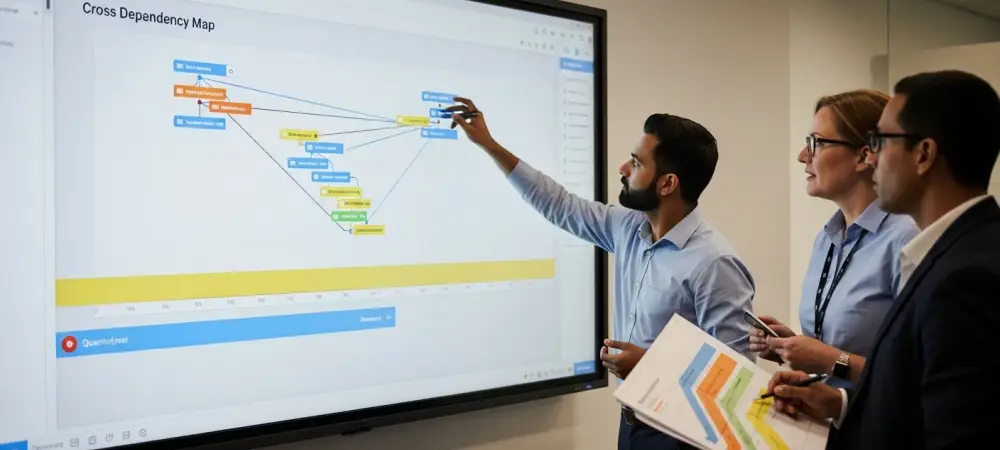
These practices translated into measurable outcomes when operationalized in platforms that supported scenario modeling, dependency mapping, and unified visibility. proMX 365 Project Portfolio Management illustrated how to embed this approach: scenario-based dashboards allowed side-by-side comparisons of portfolio options with immediate impacts on delivery health, cost forecasts, and capacity exposure; capacity views placed forward demand against planned commitments to reveal bottlenecks months ahead, a critical edge for skill-constrained environments in Construction, Energy, and Professional Services; and cross-project dependency visualization reduced ripple effects by surfacing cascade risks before they spread. Financial oversight tightened as drift became a standing signal, not a late-stage surprise, and strategic alignment stayed current through role-based executive frames that made it easy to stop, reshape, or accelerate initiatives when priorities shifted.